Reverse Engineering Polaris Buttons
Shopify's design system Polaris has released its v12 in July 2023, which came with a big design revamp. While checking the documentation pages recently, the new style of the buttons caught my eye. I really liked how they moved away from the flat design approach that has been the standard for more than a decade, but at the same time haven’t adopted a thoroughly skeuomorphic style, which, in my opinion, still generates a dated look.
In order to figure out how they managed to create this balanced effect, I’ve used a tool that I believe many designers are either unaware of, or just don’t utilize as much. Well, I call it a tool, but it’s really just a feature that your internet browser comes with, the ability to inspect elements of a webpage you are looking at.
The reason I use this feature frequently is that I believe finding good interface design and inspecting to see how it’s created is much better self-learning tool than any tutorial video you’ll find on YouTube that tells you what you should or shouldn’t do to create well designed interfaces. And here, I’d like to explain how I do it in detail for anyone who is new to this.
And even before we start, I'd like to say that this is not a tutorial to copy others' work and present it as your own. This is mainly an exercise to learn about how gradients and shadows can be used to create this kind of slight skeuomorphic effects on interfaces, so that we all can use these techniques to further create our own designs with them. So, with that, let's start.
Here is the button page for Polaris design system. (To explore more design systems, you can check this list.) On this page, you can use the button, see how it behaves on hover and click, as well as check its different variants from the tabs.
To start inspecting the primary button, just right-click on it and select Inspect from bottom of the list. This will open a new panel within your browser.
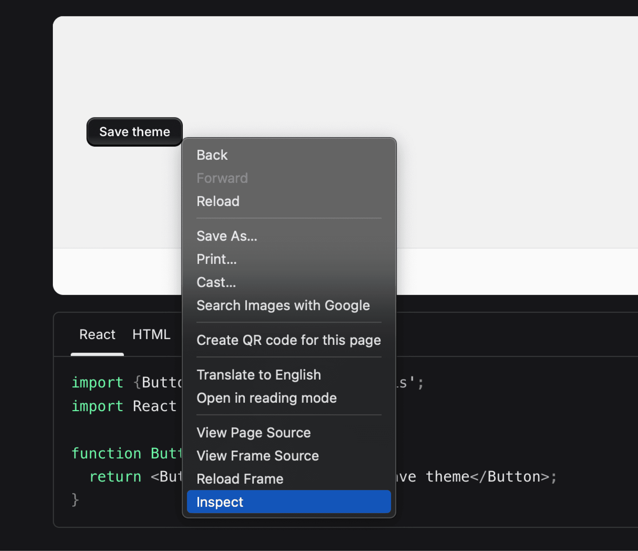
I like to see them on the right side of my screen, but you can change its position, or open this panel on a separate window. Depending on how you resize it or its sections, it will look slightly different but everything we need to see is in front of us now.
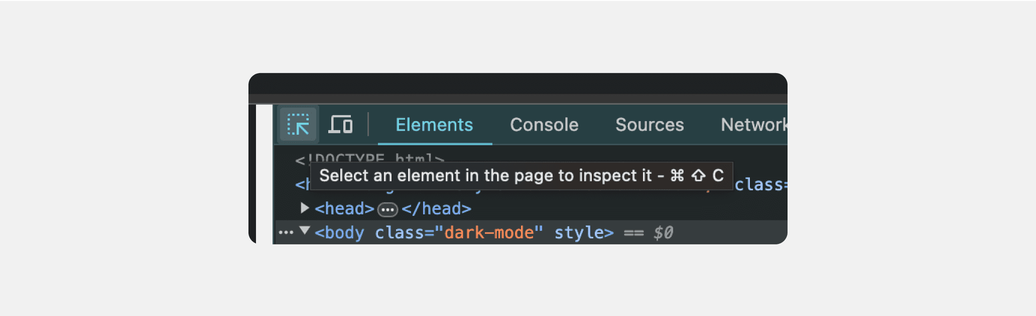
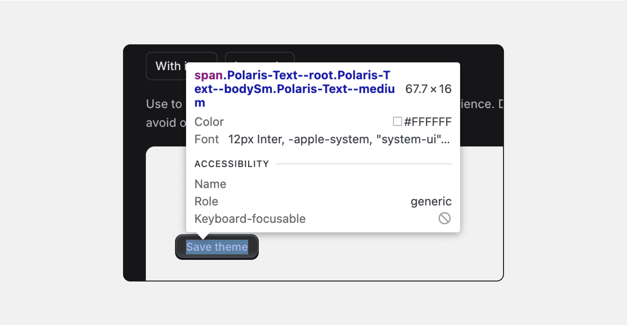
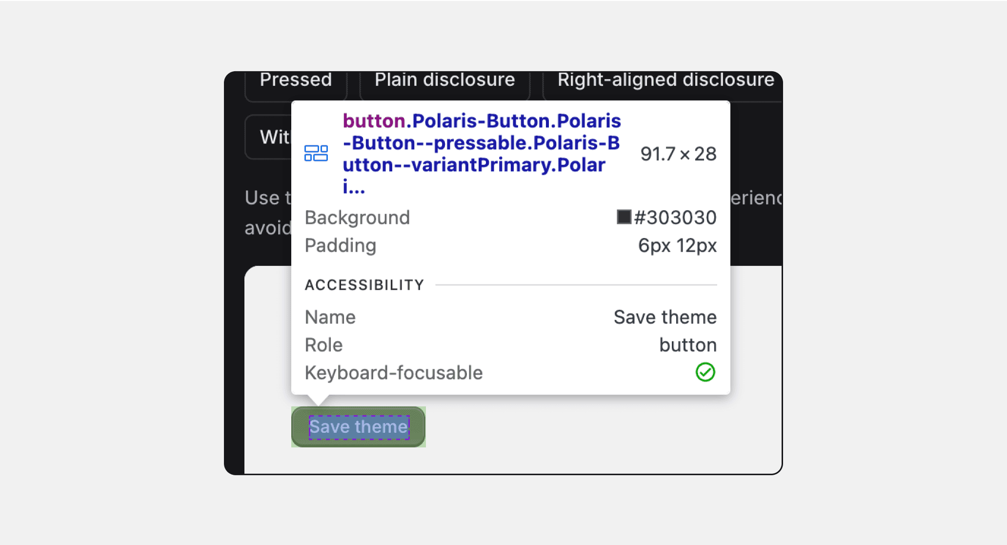
In order to be able to start recreating this button on Figma, you need some basic pieces of information about it. On the top left corner of this new panel, you’ll see a button with an top-left arrow called “Select an element in the page to inspect it.” Click and activate it. Now using your mouse, hover on the text and button itself to see its details.
When I hover on the text alone, I can see its details. The font is Inter, with 12 points font size, and plain white #FFFFFF color value. From element size (67.7 x 16), I understand the line height is 16 points, and from the element name, I learn that font weight is Medium.
Hovering just between button’s text and border, I can see its sizing properties.
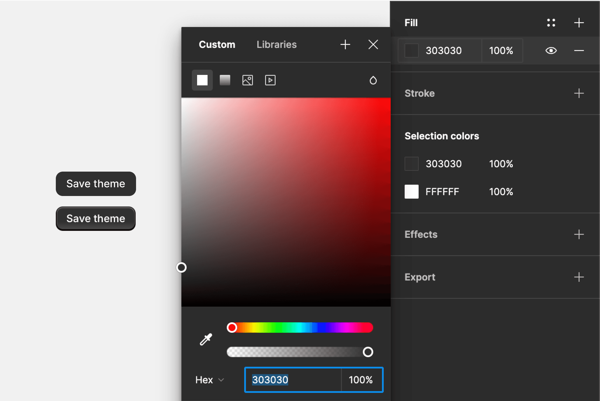
With padding values of 12px for left and right, 6px for top and bottom, my button also gets the height of 28px. I don’t see the radius value here, but I can look and estimate that it’s 8px, and I can check CSS later to make sure. And finally for the background color value, I see the color #303030, so I fill my button with this color.
Next to a screenshot I got from the website, it looks fairly close, but we are obviously missing a number of details still. My button doesn’t have any gradient values, borders, or shadows yet. So let’s find out what else we need.
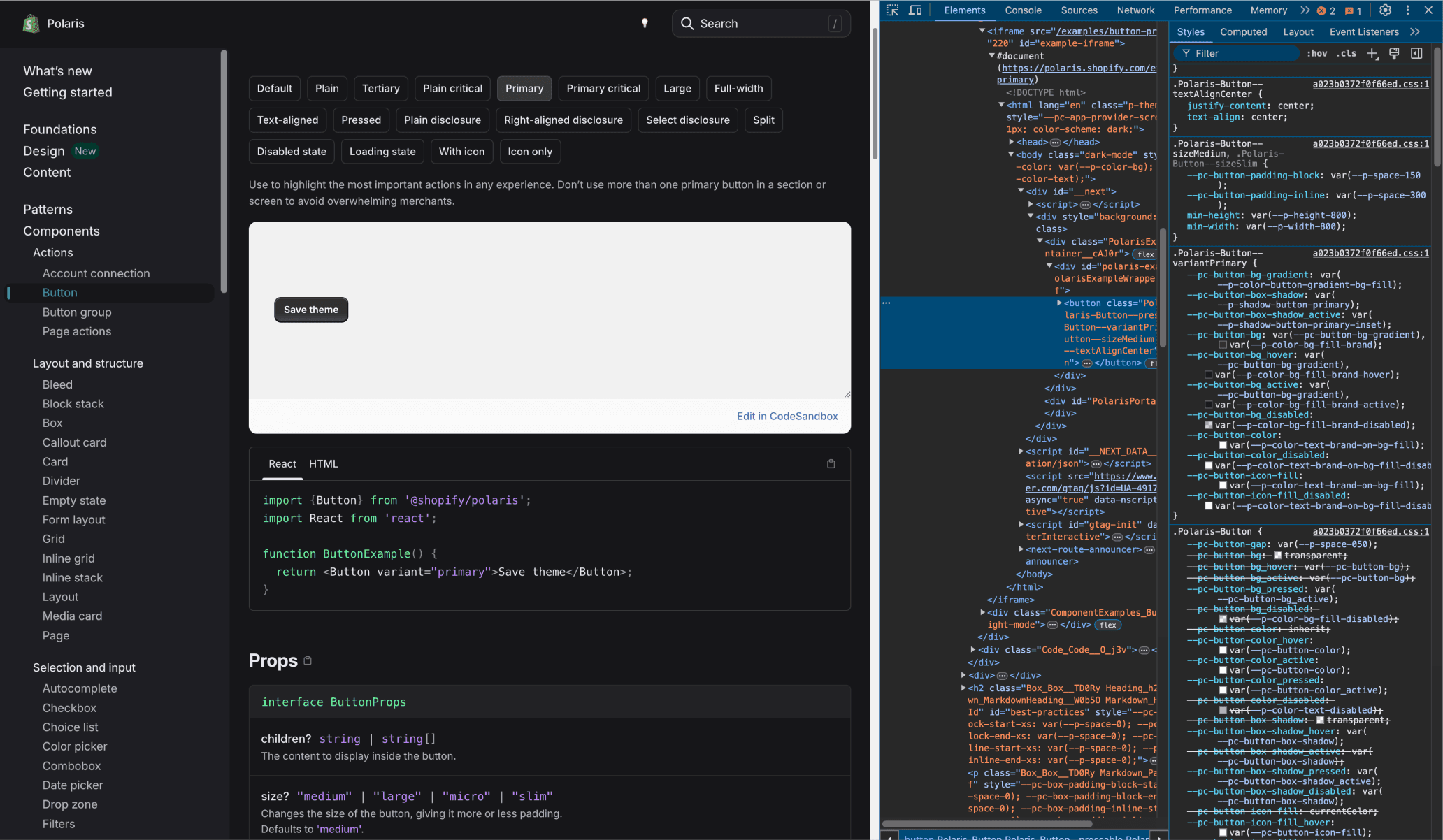
Now let’s get back to our browser and click and inspect the button and check the panel. On Elements tab, you’ll see the button element selected within the HTML code (slightly lighter part on left side). When that section is selected, Styles tab on right side of the dock should show all the styling details about this element.
This list will be a long one, but don’t let it discourage you. While there are a lot of things to learn from this list, such as naming conventions for design tokens etc., it’s also easy to find the stuff you are looking for if you know where to look.
As we are interested in the details that makes this primary button different from the other variants, namely background colors, borders, inner shadows etc., you’ll need to find the associated section.
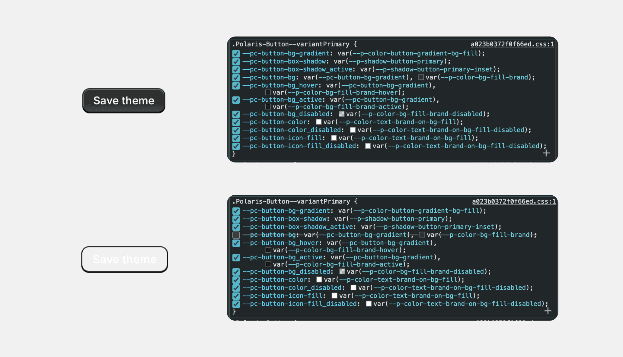
For this button, it’s the .Polaris-Button--variantPrimary section. And here, when you hover on a line, you can see checkboxes that will inactivate them on the page.
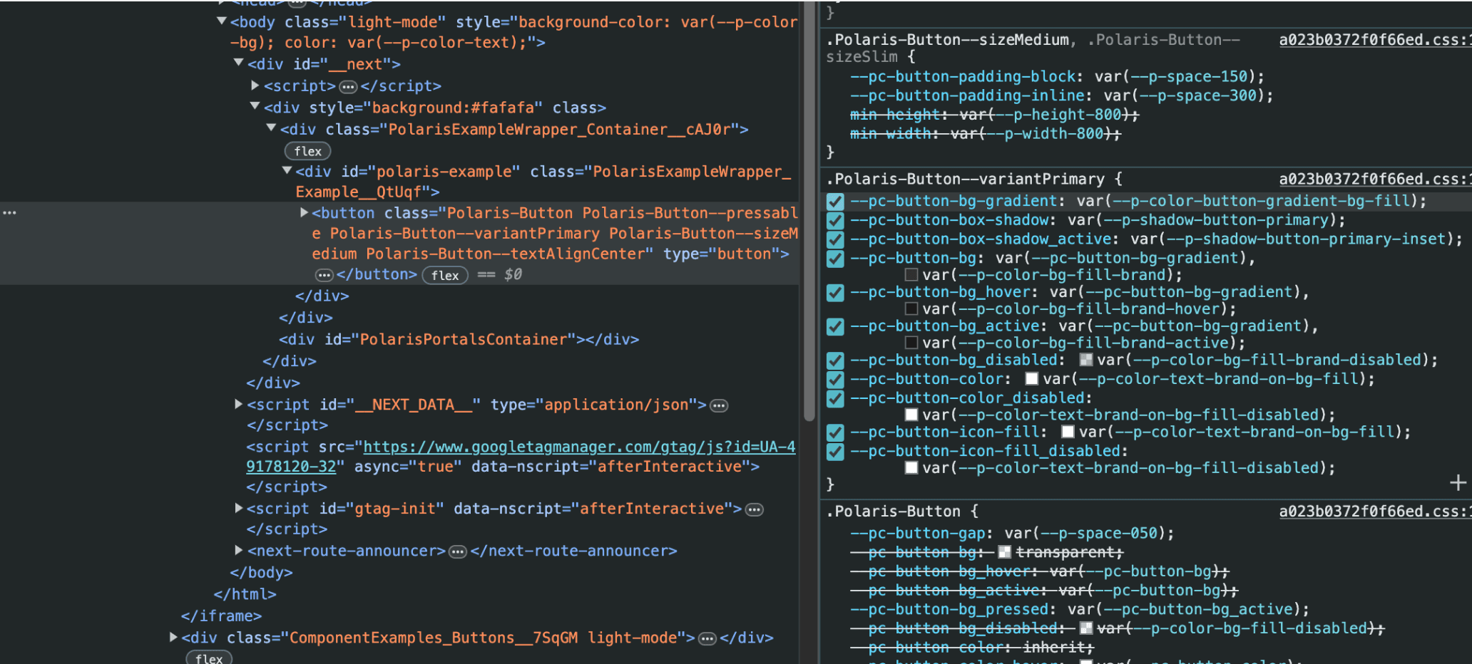
Let’s start with figuring out the background fill of this button. Just looking at the button, I can see that there is a gradient at the bottom part of it, with a lighter color to give it a feeling of being lit up from an angle.
Looking at the first line in this section, --pc-button-bg-gradient, I can understand that it’s a gradient value. But to make sure it’s really associated with the button I’m inspecting, I’ll try to inactivate the line and see what this will change on the page and the style panel.
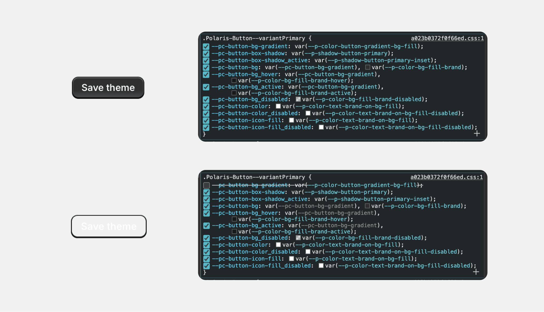
As you can see, inactivating the line removed the background fill for the button, but it’s not the only thing it changed. If you check the following CSS lines, you can also see that it affected 4th to 6th lines as well.
The first affected line, the 4th one named --pc-button-bg, now has a greyed out token. From this, I can assume that even though the first line broke the styling of the button, it also broke these lines as well, which might be the root cause for breaking the styling.
Moreover, the naming of this token feels bit more primitive (in context of design tokens), so I activate the first one and inactivate this one and get the same visual results without breaking any other styling line. Then I can assume that this actually is the line that I’m looking for the background fill of this button. So what does this stuff on this 4th line mean?
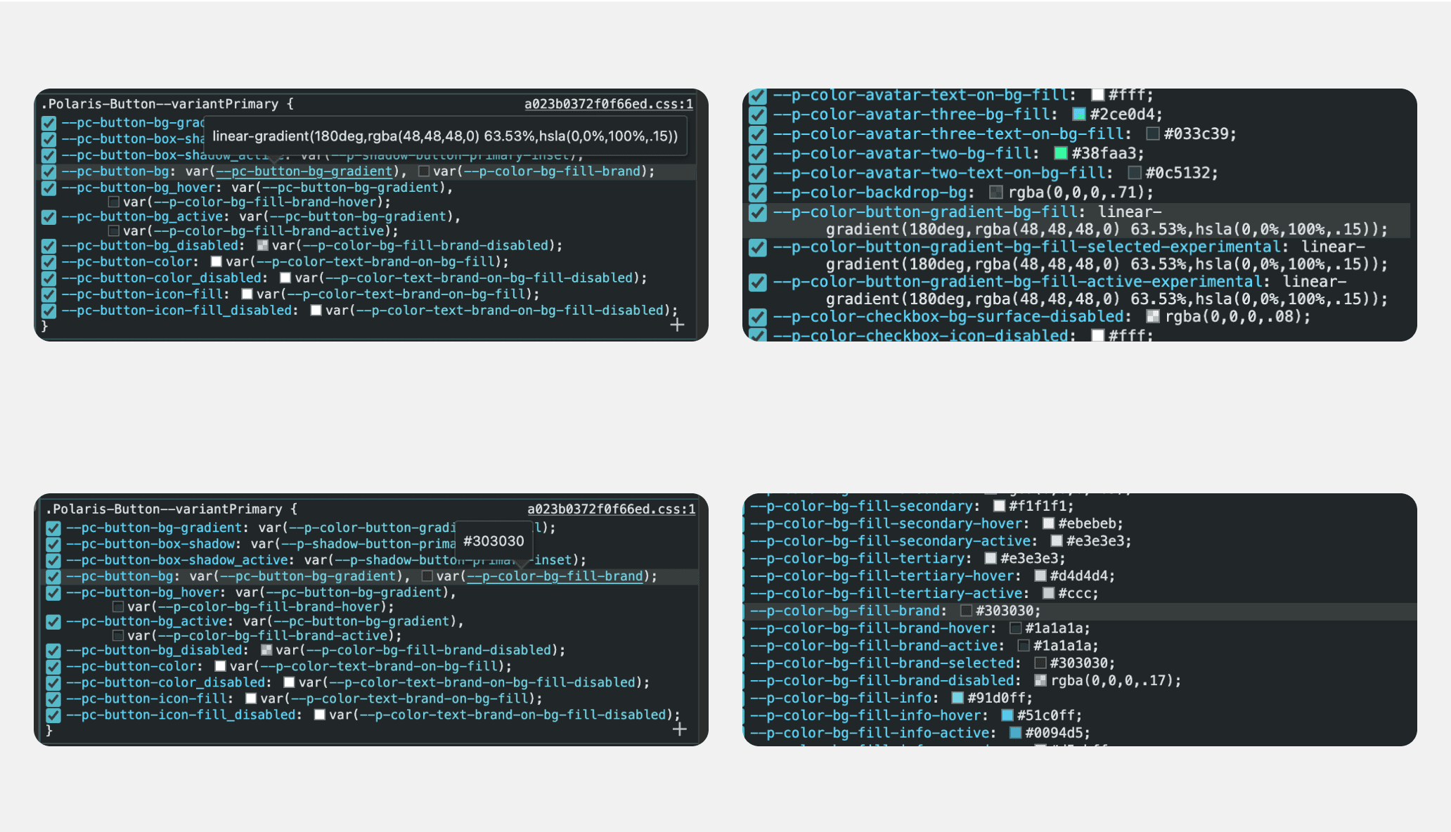
Basically, the background of the button is styled by using two tokens on top of each other, one gradient (the one I inactivated initially) and a regular fill color token:
--pc-button-bg equals --pc-button-bg-gradient plus --p-color-bg-fill-brand
In order to see the associated values for these tokens, you can hover the token names, but you can also click on them, which will scroll down and show you the line that defines that token with its value.
For the first token, --pc-button-bg-gradient equals --p-color-button-gradient-bg-fill, which in turn equals the value linear-gradient(180deg,rgba(48,48,48,0) 63.53%,hsla(0,0%,100%,.15))
For the second token, it’s simpler. --p-color-bg-fill-brand equals #303030. This is the value I used when I started creating my button on Figma. So what I need on top of this fill color is the gradient value I found here.
In order to recreate this gradient, I’ll need to figure out what these values mean, and how they can be replicated in Figma. I’ll also place a screenshot of the original button underneath to compare my button. (To learn more about CSS gradients, check this page.)
linear-gradient(180deg,rgba(48,48,48,0) 63.53%,hsla(0,0%,100%,.15))
The first part linear-gradient means gradient will be Linear type, as opposed to Radial, Angular, or Diamond. For my button, I create another fill (and turn its opacity to 100% from default 20%) and turn it into gradient. Linear is already the default value for gradient fills.
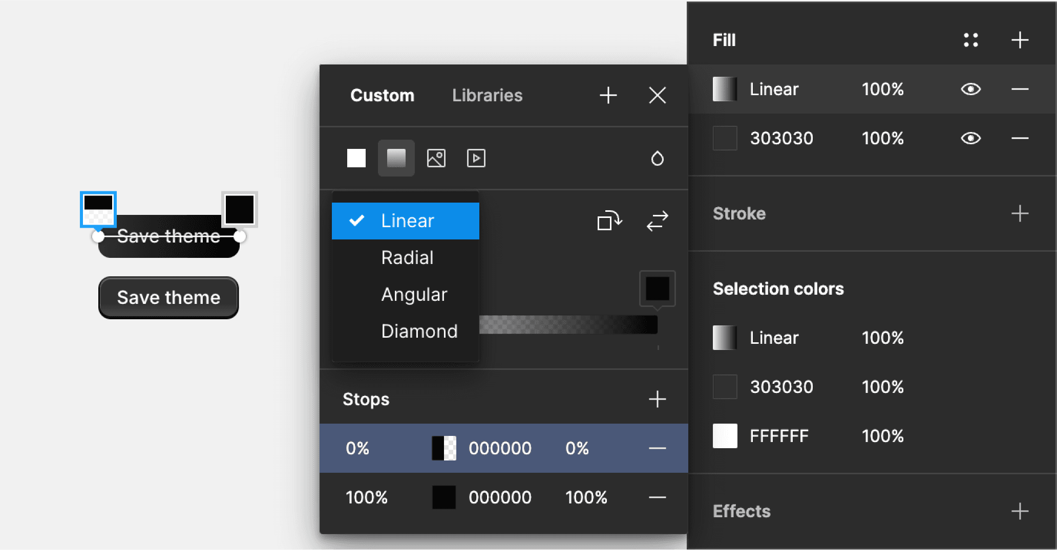
The next one, 180deg, tells about the direction of the gradient, 0deg is from bottom to top, 90deg is from left to right, and 180deg is from top to bottom, and so forth. So our first color will be on top, and second on bottom, at least in relation to each other.
Figma’s default linear gradient is 90deg, from left to right, so I click once on “Rotate gradient” button here, to make it 180deg, from top to bottom.
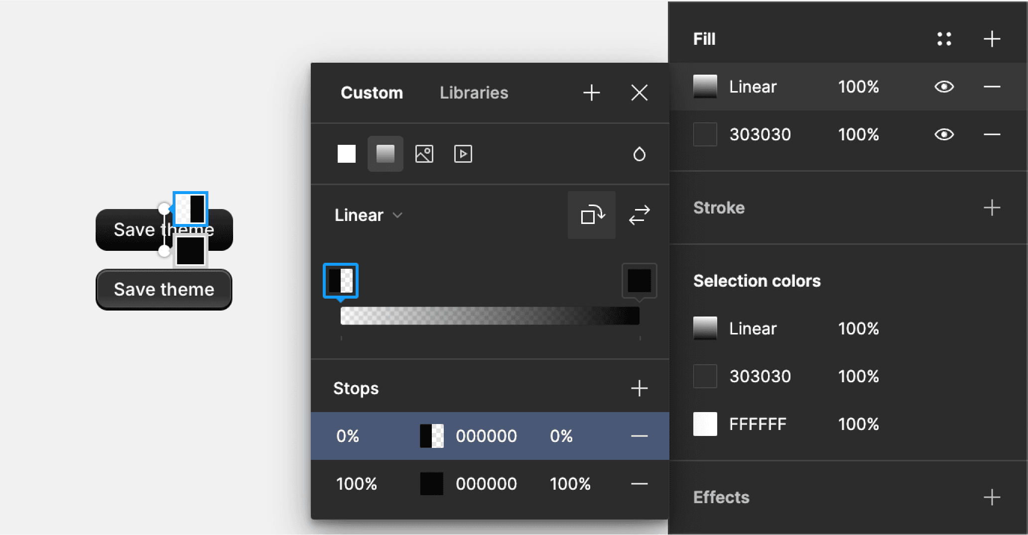
The last two pieces of information I have are the color values and their stops on the gradient. Let’s start with the first color.
rgba(48,48,48,0) 63.53%
The starting point of the gradient will have a RGB value of 48,48,48, which is the same color as background, #303030, but with Alpha value of 0, which means opacity of 0%.
And the 63.53% here indicates its position on the gradient, around two thirds of its length, which is rounded up to 64% on Figma.
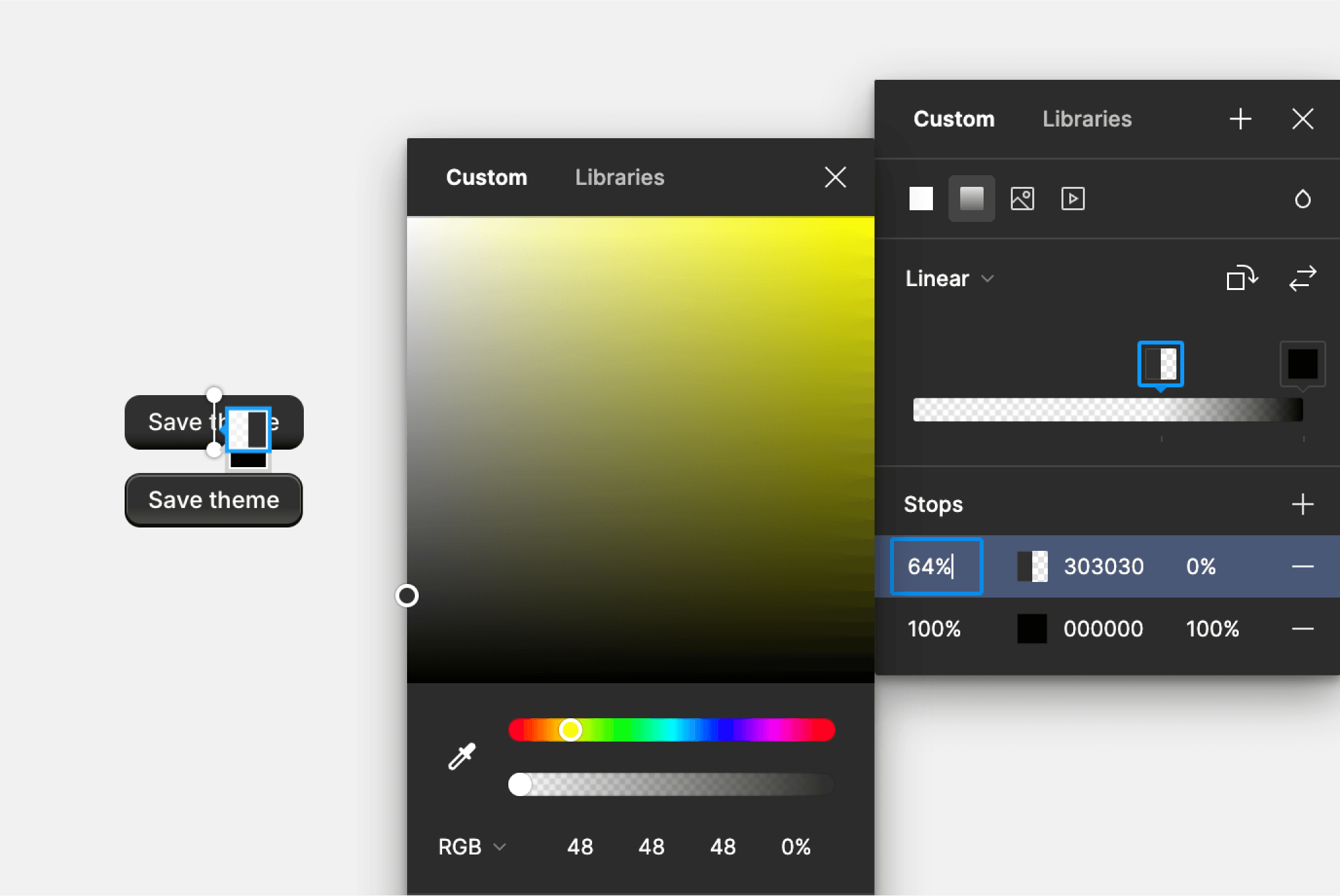
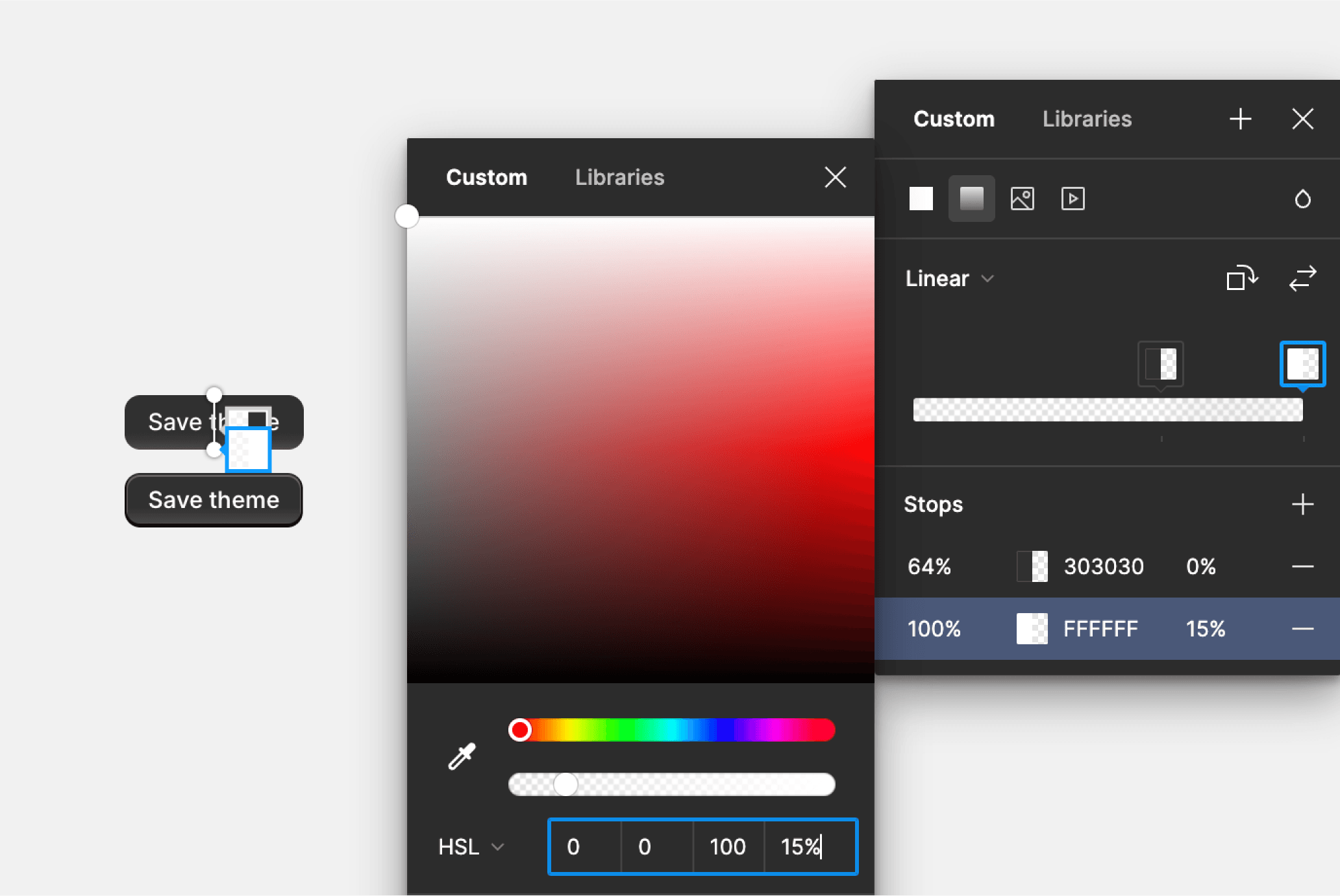
For the second color, hsla(0,0%,100%,.15), we have an HSL value, which you can switch to by clicking on RGB on color picker, and enter the first three numbers, 0, 0, 100, which gives you pure white, or #FFFFFF color.
Alpha values are between 0 and 1 in CSS, and between 0% and 100% on Figma. So the alpha value of .15 equals to 15% on Figma.
There is no position value for the second color on the gradient, which means it is at 100% stop. (If the first one had no value, it would be 0%. Check the CSS gradients link above to learn more.)
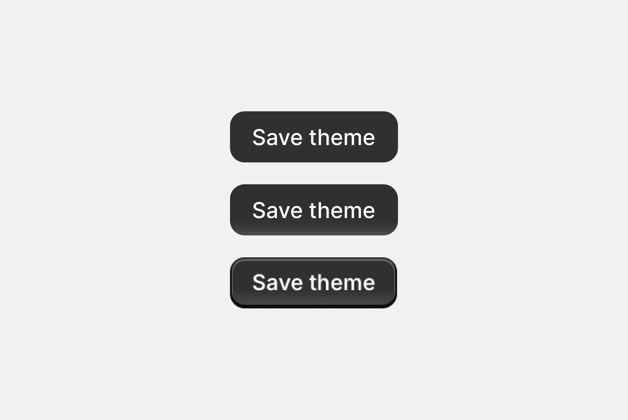
Let’s zoom in and compare three versions, (1) my button before the gradient, (2) after adding the gradient, and (3) the original button from Polaris page.
The difference that the gradient create is very slight, but it’s the details that matter the most and create this soft skeuomorphic effect for this button.
So what I need to check next is these lighter and darker lines on top and bottom sides of the button. It’s possible to create them using borders, as well as shadows, so let’s get back to CSS panel.
Well, it doesn’t take much investigating, as inactivating the second token on this list makes these lines for the button on the page disappear (without breaking other lines). Now I know where these lines are coming from.
--pc-button-box-shadow equals to --p-shadow-button-primary
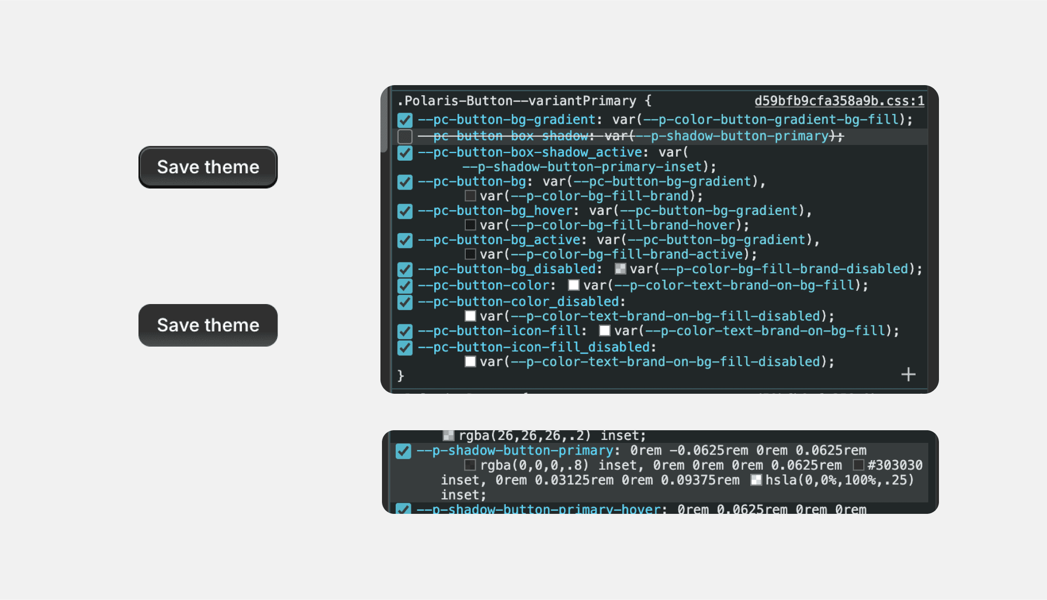
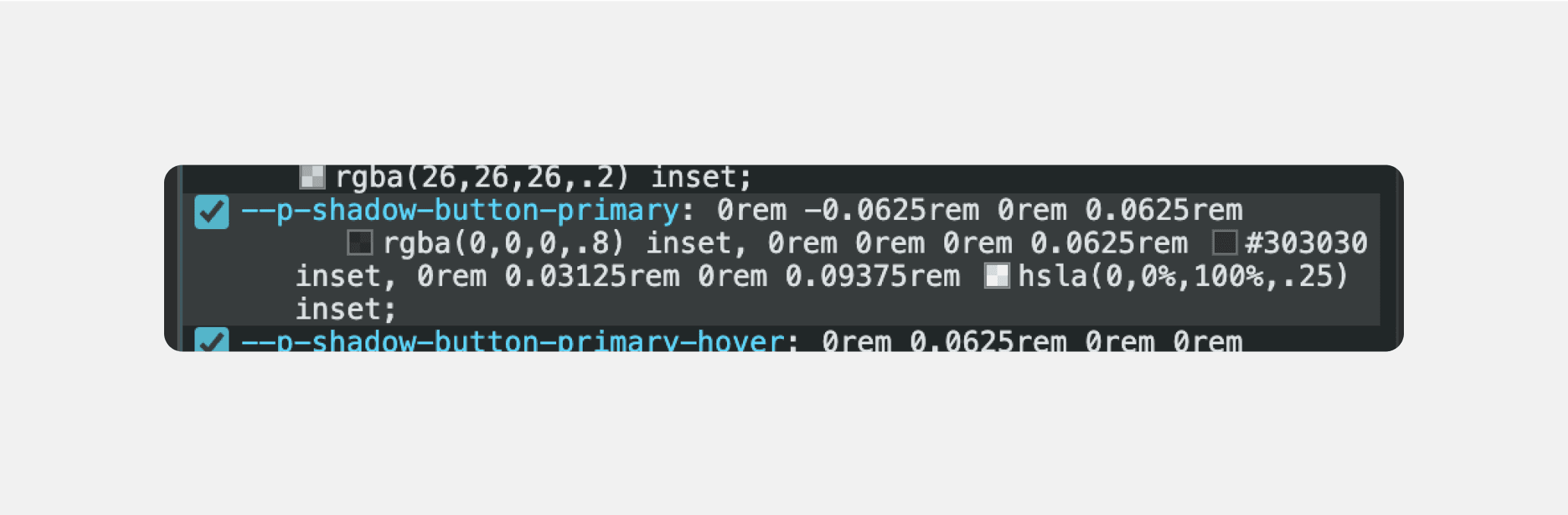
And clicking on --p-shadow-button-primary, I get the following values:
0rem -0.0625rem 0rem 0.0625rem rgba(0,0,0,.8) inset,0rem 0rem 0rem 0.0625rem #303030 inset,0rem 0.03125rem 0rem 0.09375rem hsla(0,0%,100%,.25) inset
That’s a big chunk of information so I’ll just separate different values to different lines to be able to see what we have here. For CSS, different values are separated by commas, so after each comma, we have a separate value, which gives me 3 different shadows used on top of each other:
0rem -0.0625rem 0rem 0.0625rem rgba(0,0,0,.8) inset,
0rem 0rem 0rem 0.0625rem #303030 inset,
0rem 0.03125rem 0rem 0.09375rem hsla(0,0%,100%,.25) inset
But even before going into each line, we need to learn a little about “rem.” The unit of rem stands for “root-em” which has a long history (you can check Em article on wiki), but we don’t really need to know the details about it to use it.
Basically, 1rem = 16px (unless defined differently for that particular site) when you are using your browser at 100% zoom, and using rem values instead of pixel values on a website helps browsers to resize everything properly when users resize your site by zooming, changing the default font size for browser, or any other method. And if you use number values, the browser cannot reliably render your design the way you intended. If you need 8 pixels, you use 0.5rem, if you need 4 pixels, you use 0.25rem and so forth.
So for the values of these shadows the following is what you need:
0.03125rem = 0.5px
0.0625rem = 1px
0.09375rem = 1.5px
------------------------------------------------------------------------------------------------------------
Okay, that’s it for the rem, let’s get back to our shadows. I’ll create them in the same order, first being on top of other two and second on top of third. If the ordering is different, the final result will look different because how they overlap each other.
For a CSS shadow, there are 6 values, and they follow almost the same order in Figma.
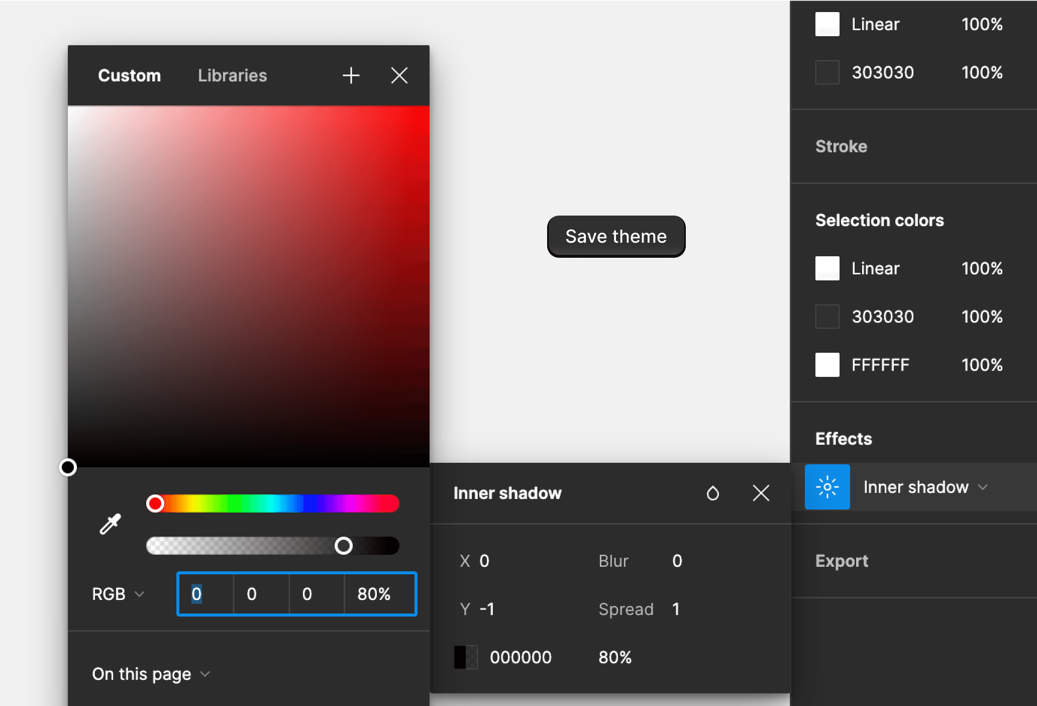
For the first shadow’s values 0rem -0.0625rem 0rem 0.0625rem rgba(0,0,0,.8) inset, I create an Inner Shadow (from “inset”) with values of X:0, Y:-1, Blur:0, Spread:1, and color of full black at 80% opacity. This adds the bottom dark line.
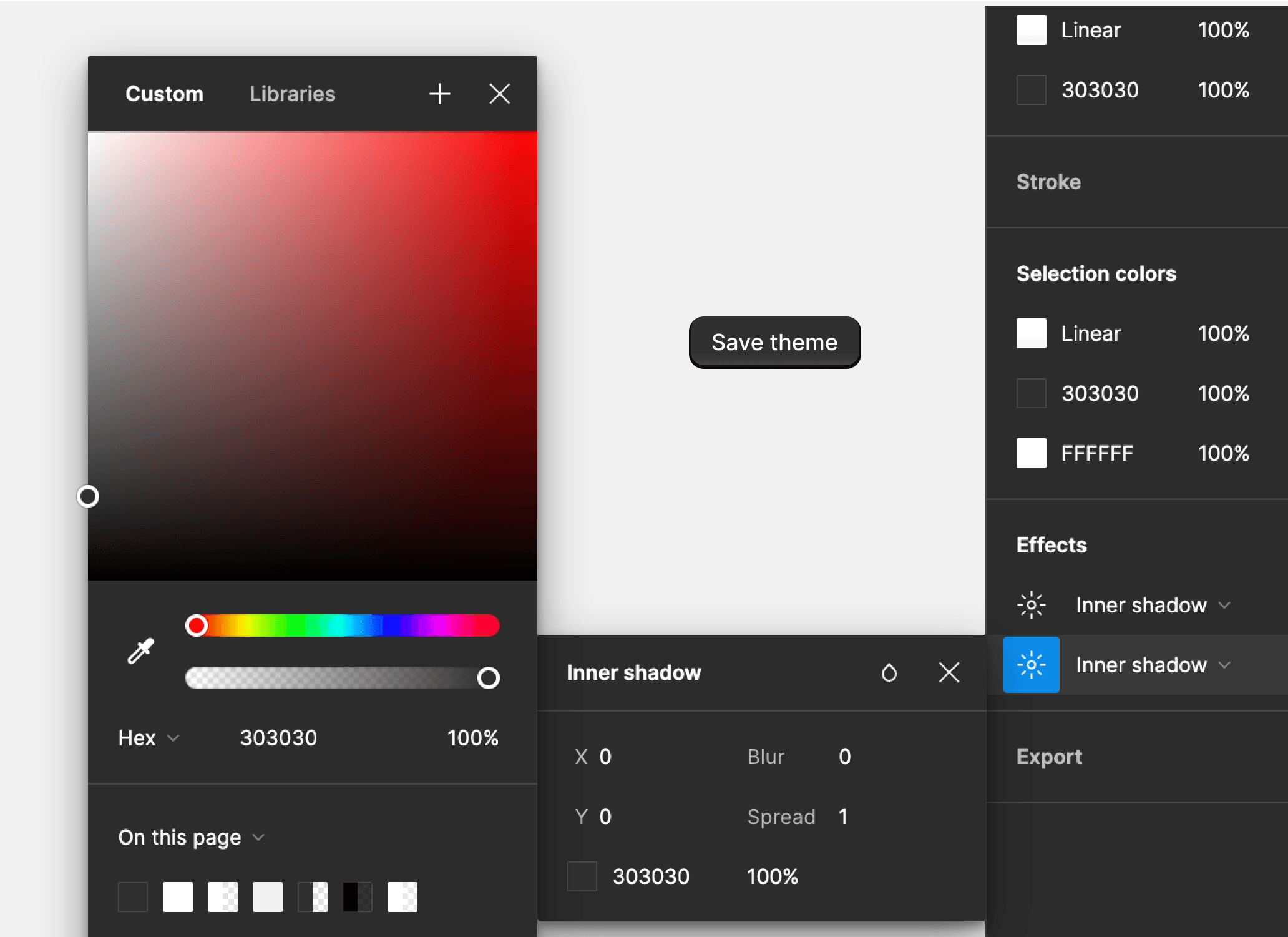
For the second shadow’s values 0rem 0rem 0rem 0.0625rem #303030 inset, I create an Inner Shadow with values of X:0, Y:0, Blur:0, Spread:1, with color same as background at 100% opacity. This adds a thin inner border that’s not entirely visible now, but will give a bit of elevation to the other two shadows.
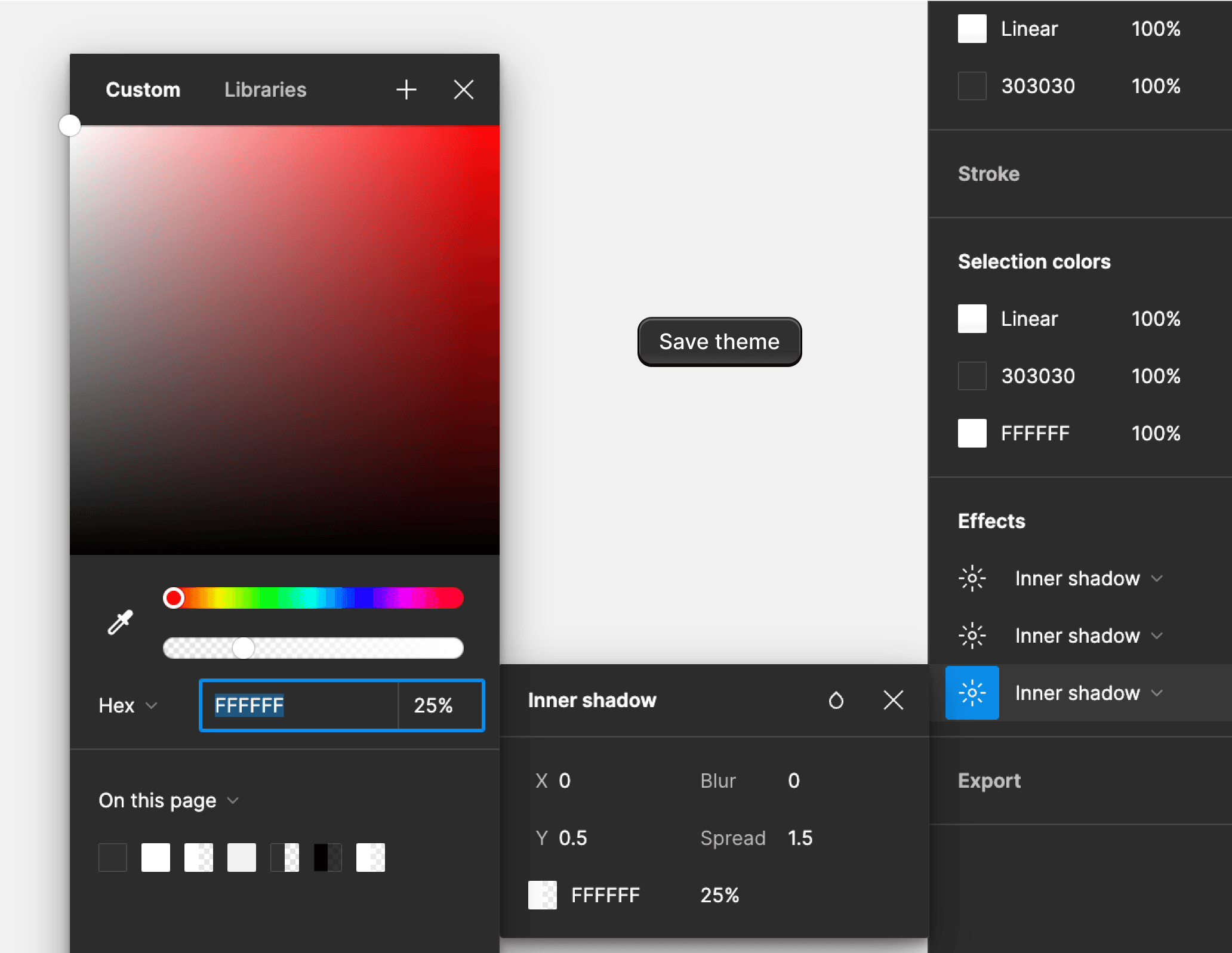
For the third shadow’s values 0rem 0.03125rem 0rem 0.09375rem hsla(0,0%,100%,.25) inset, I create an Inner Shadow with values of X:0, Y:0.5, Blur:0, Spread:1.5, with pure white at 25% opacity. This adds the lighter line on top side that gives the feeling of being lit up from up, and combined with second shadow, creates an effect of button popping out.
And again, let’s zoom in and compare (1) my button before the shadows, (2) after adding the shadows, and (3) the original button from Polaris page.
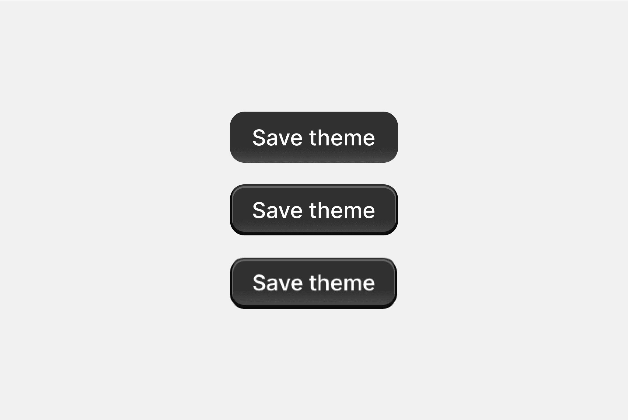
I believe that’s it. We have reverse engineered and recreated the primary button from Polaris DS.
This turned out to be a much longer article than I have anticipated, but for now this should be it, as I believe this is already a lot of information for a beginner.
We have checked CSS values for gradients and shadows, and learned a bit a about rem values, and how they translate to Figma’s pixels. I hope to continue with a second part, checking other components from Polaris DS to learn further about CSS, and how to learn from successes of others.